Gather brand material
Collect your website, guidelines, logo files, approved colours and reference images. Include examples of styles you want to avoid. Complete the onboarding questionnaire first. Brand Asset uses your submitted answers and files to prepare the first Brand Guide with you.
Name the guide and style
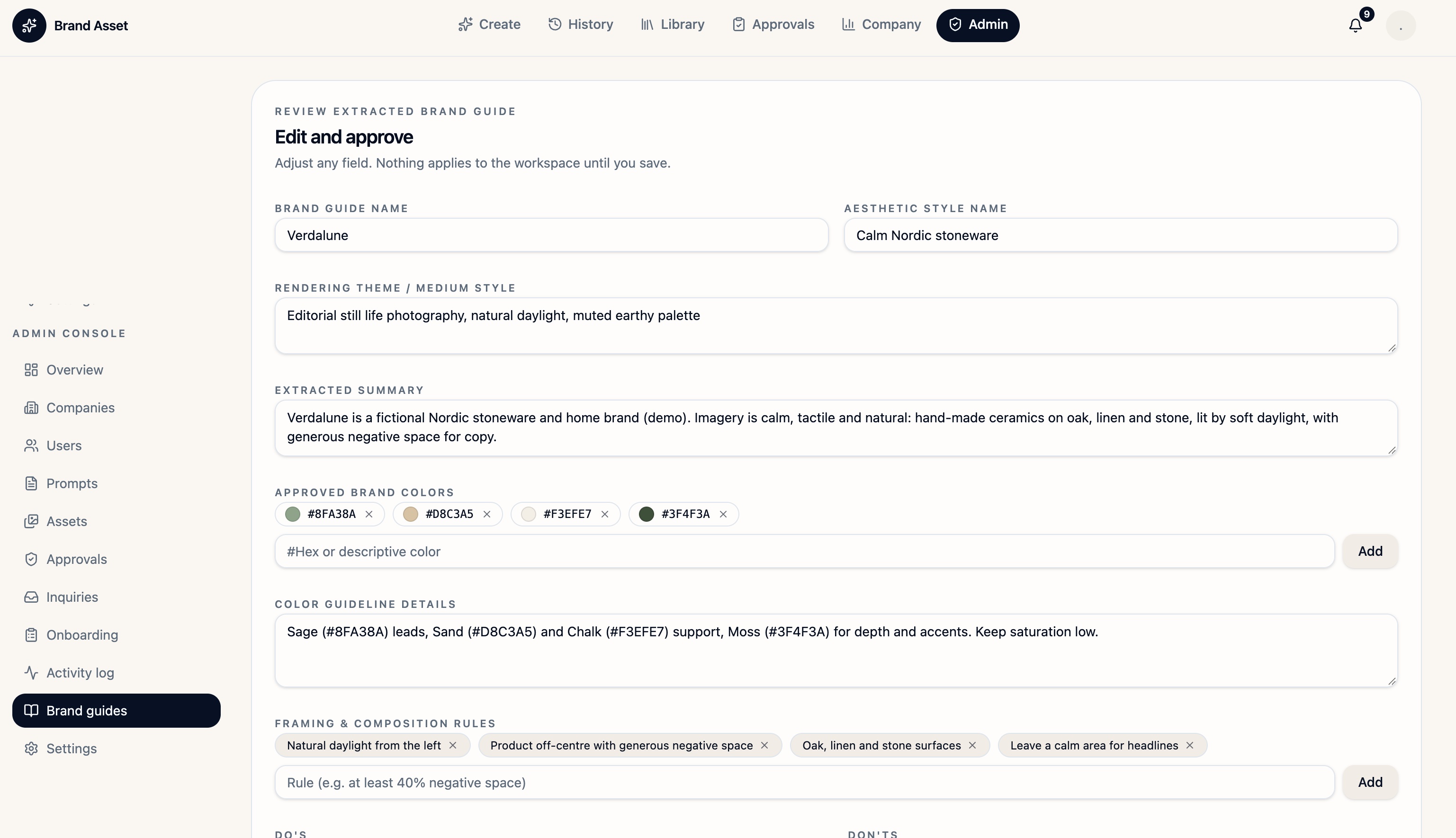
Brand Guide Name: Verdalune. Aesthetic Style Name: Calm Nordic stoneware. Rendering Theme / Medium Style: editorial still-life photography in natural daylight. Extracted Summary: handmade Nordic ceramics on oak, linen and stone.
Define colour and composition
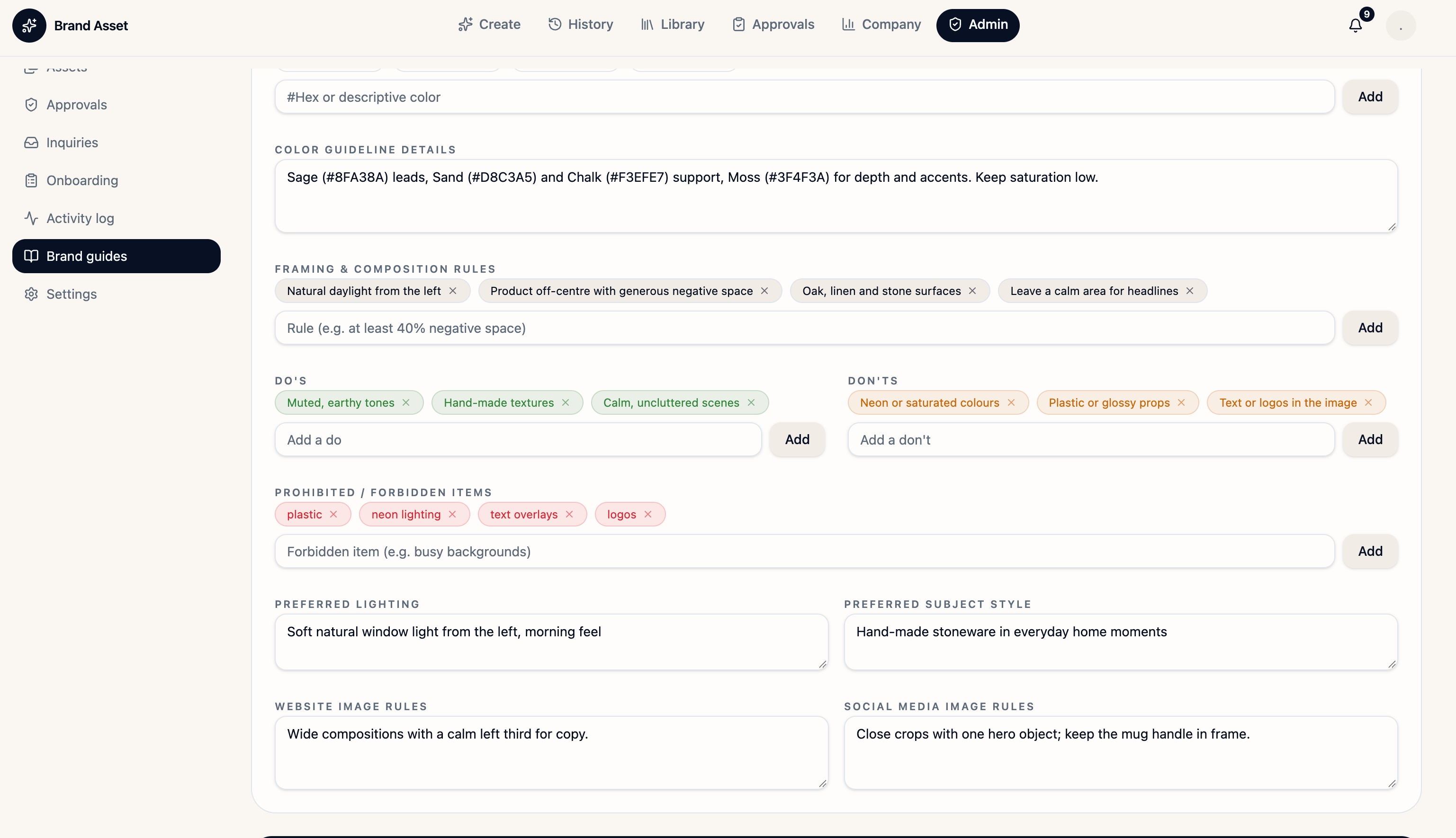
Approved Brand Colors: Sage #8FA38A, Sand #D8C3A5, Chalk #F3EFE7 and Moss #3F4F3A. Color Guideline Details: lead with Sage, support with Sand and Chalk, and use Moss as an accent. Framing & Composition Rules: keep the product off-centre and leave a calm area for a headline.
Set the visual boundaries
Do’s: muted earth tones, handmade textures and uncluttered scenes. Don’ts: saturated colours and glossy props. Prohibited / Forbidden Items: plastic, neon lighting, text overlays and logos in the generated image. Preferred Lighting: soft morning light from the left. Preferred Subject Style: handmade stoneware in everyday home settings.
Set channel and logo rules
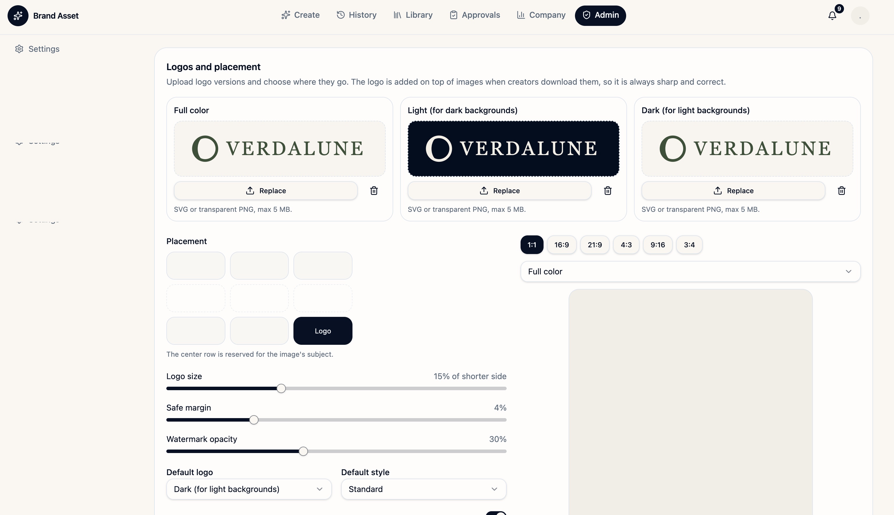
Website Image Rules: use a wide composition with the left third free for copy. Social Media Image Rules: crop close around one main object and keep the mug handle in frame. In Logos and placement, provide full-colour, light and dark variants. The demo uses bottom right placement, a logo size of 15% of the shorter side and a 4% safe margin.
Check the active guide
Review the draft with your onboarding contact. Ask them to save and assign it to the correct workspace. Verify the guide in Create, then test a wide and a vertical image and check the exported logo.
Editor screenshots are from the Verdalune demo. Saving and assignment require verification in the current platform admin view.